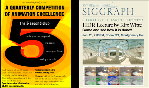
I must thank Jacque, a student in the SCAD writing department, for providing the subject of tonight’s blog post. She reports that the image below was on the desktop of the college’s computers.
Ordinarily, I’d ask you to avert your eyes at such hideousness, but not tonight. Tonight I want you to look. Focus on it in all of its glory. And then let’s talk about it.
WHAT is going on here? Do people in these departments not know that there are people at SCAD who can help them write and design marketing materials? Is Montgomery Hal any relation to Shallow Hal? How many fonts are represented overall? And the colors! The colors! GAH!
Please make it stop.


Uh – yea. This needs serious help.
LikeLike
It is embarrassing because SCAD is an art and design college. What we produce overall should be better.
LikeLike
My, My, not the usual SCAD.
To make you feel better I was at a Hilton Head Island Chamber event today and met a SCAD grad (2000) who was just wonderful. He is a partner in two new companies on HHI and their graphic design and web work is fantastic. I was very proud of him.
Beth, I love your blog. I have started one but am shy about making it public yet. You are my blog mentor.
LikeLike
Thank you, Nancy. I can’t wait to read anything you write!
LikeLike
I like the Electric Company “5” thing but the font lacks energy. Placement works. Type needs more oooomph.
Animators and sound designers… you are good at what you do. I cannot begin to do what you do. Hire a graphic designer to do what you can’t. We’re here to help.
FYI. Graphic designers work with editors. So spelling mistakes are corrected before you go “live!” (Going “live” is kind of a big deal.)
LikeLike